How to choose the right color and style of corporate uniform?
You have made the decision to labeled branded corporate uniforms. Well done. Let’s have a look at how to choose the right colors and styles for your business. You will need to look at your corporate branding and marketing plans to make sure the uniform suitably represents your brand.

Style
Don’t follow retail fashion trends. They come and go too quickly and as a corporate uniform is an investment in time and money you don’t want it to be outdated in a year. Instead, look to create the right colors for uniform with classic styling that will stand the test of time.
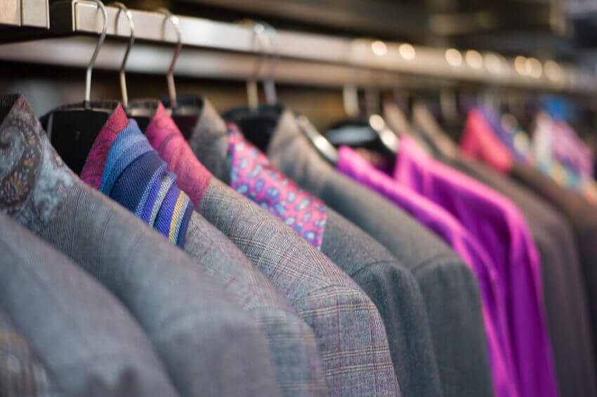
As said above a classic style is going to have a longer shelf life than anything that is fashion-focused. Now in saying that, no one wants to be dressed in a boring uniform. It’s about finding a balance between a classic outline and adding in good colors, shirts, or accessories to keep your corporate uniform current. You want your customers to feel they are dealing with a modern business that understands today’s needs.
The style of corporate uniform also needs to fit the requirements of the employees, workers, and staff and the different jobs they do. It’s not just about looking good; the uniform must be comfortable and functional. Will the uniform have enough pockets for the ment job? Does my team require stretch fabric?
to allow them to perform to their best? Does the style of the shirt really tell my customers what we are all about?
the right colors for uniform
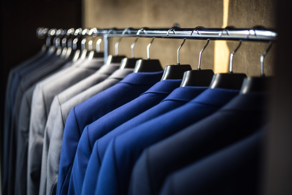
As with color, the style of your corporate uniform needs to fit with your company branding/ labeling/ image and industry. Some of the more traditional business industries will require a well-cut suit for their team. Something classic that shows a high level of professionalism and excellence. For example, you want to have full confidence in your financial advisor that they are going to set up your money to work for you well into retirement. A sharp suit or at least a good business shirt will put in that confidence much better than a t-shirt and jeans.
Business like hospitality sees the staff bending over tables and bars all the time to reach plates and glasses. A longer line shirt will mean that the clients will not be presented with bare midriff each time a staff member leans over. This is a small thing to think about but will make the staff and clients more comfortable and keep that good professional image always.
Sun protection should be part of the style thought for outdoor workers. We have already talked about a light color but more importantly, a full sleeve and a collar will keep the harsh Australian sun off the arms and necks of the workers. It is highly likely these workers will also require a brimmed hat to keep their ears and face protected. Always think about color and styling, no matter how small the detail to keep in line with the image of your branding/labeling and business as well as make sure all team members look and feel their best at work and are visible.
Color
The more team members in the same brand color the better it is for the business as it sends a strong as one message to the customers that everyone is working to achieve the same end goal.
There are a few factors that need to be believed when it comes to color. You may have orange, green, and yellow in the logo, however, an orange corporate uniform may not send the right message to the customers. For your brand, would a classic color like a black or navy background work better with an embroidered color logo?
Think about what type of industry you are in. Are you a corporate company in, say, the finance, legal, or government sector that needs to be traditional or skillful with color? Or are you involved in a full of energetic industries like fitness, retail, or hospitality?
Colour for practical purposes also needs to be believed. Those working in hospitality are subject to drink, food, and oil stains so it’s a good idea to select the right colors for uniform that best hides accidental stains on the job. This way the team maintains a smart image for their shift.
Colour for the image is a key factor. Those in a specialist medical situation often choose white as it portrays a clean and sterile look, which adds to giving confidence in the clinic and staff’s ability to deliver the service. Colour for safety is extremely important. Anyone working in a dangerous situation with machinery, equipment, and vehicles will know that the ability to be seen is key. This keeps employees, workers, and staff safe from possibly dangerous situations. It’s like a forklift driver accidentally running over another team member. Another factor for safety is sun protection, if you work outdoors every day a lighter color like white or natural is going to keep you cooler longer than a darker shade.


